How to Choose a T-Shirt Color That Flatters You and the Print
Choosing a t-shirt color comes down to 3 things: your skin tone, the contrast with the artwork, and how the fabric wears. Here's how to pick each, plus safe colours for gifts.
By SkyMade Design · · 6 min read
To choose a t-shirt color, match it to 3 things in this order: the artwork, your skin tone, and how you'll wear it. Get the first one wrong and the print looks flat no matter how good the colour looks on you. Get all 3 right and the shirt becomes the one you reach for first.
This guide covers each step, the difference between heather and solid fabrics, why light tri-blends can look see-through, which colours hide wear best, and how to pick a colour safely when the shirt is a gift.
Step 1: Start with the print, not the shirt
On a graphic tee, the artwork is the point. The shirt colour is the background, and a background's job is contrast.
- Bright, multi-colour art (neon sunsets, pinks and oranges) pops on white, black and deep navy. It turns muddy on mid-tones like grey or olive, where the colours sit too close to the fabric.
- Dark line art needs a light shirt: white, natural, light heather.
- Pale or pastel art needs a dark shirt.
A quick test: squint at the product photo. If the design still reads clearly as a shape, the contrast works. If it blurs into the fabric, pick another colour.

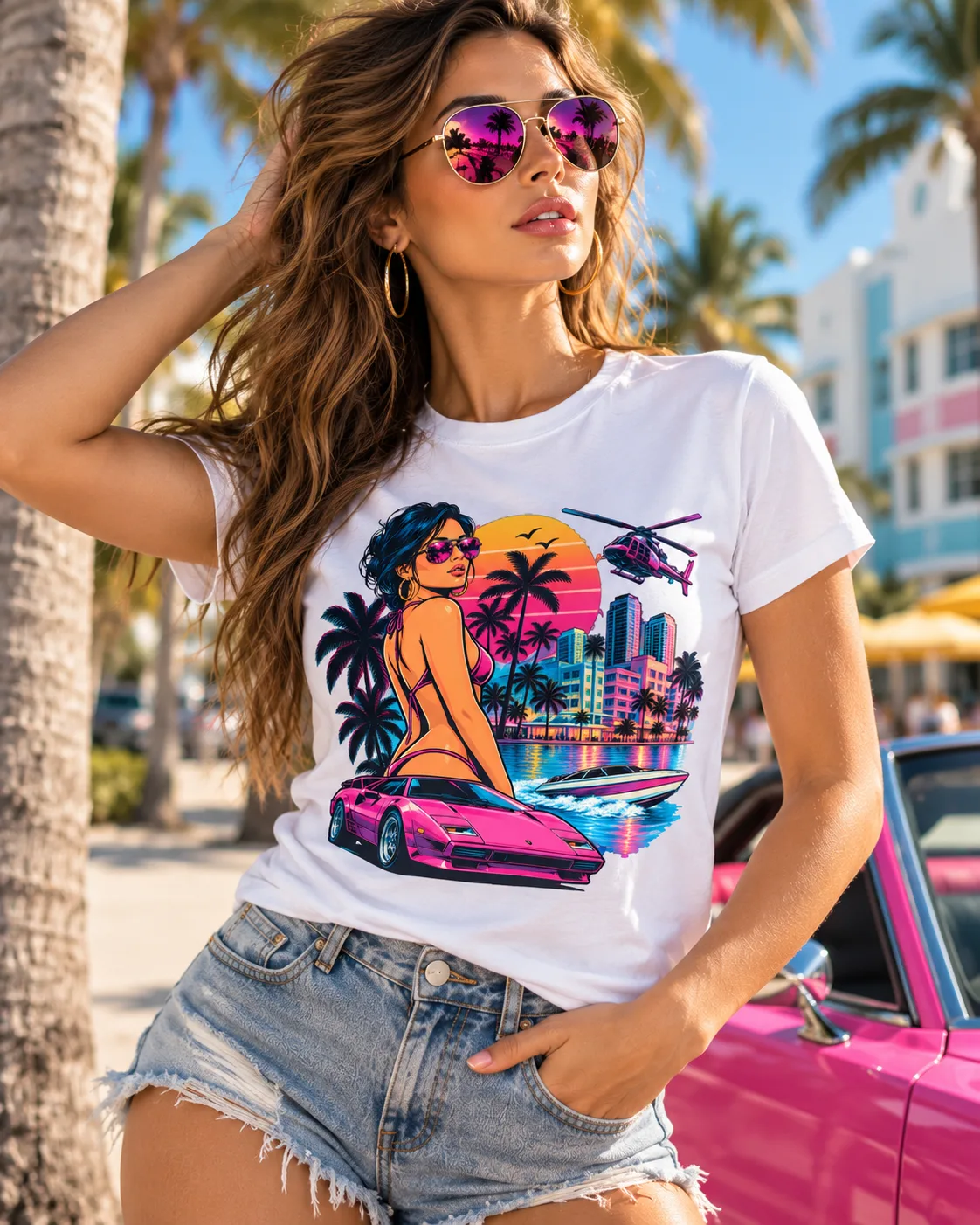
The Miami Sunset Woman tee is a good example. Its bright neon colours are made for strong contrast, so it works on dark, saturated shirts and on clean light ones, and loses punch on dull mid-greys.
Step 2: Match the colour to your skin tone
Once you know which colours suit the print, narrow them down by what suits you. The rule of thumb is about undertone, the colour under the surface of your skin.
| Undertone | How to spot it | Colours that tend to flatter |
|---|---|---|
| Warm | Veins look greenish, gold jewellery suits you | Olive, rust, mustard, cream, warm red, coral |
| Cool | Veins look bluish, silver suits you | Navy, royal blue, emerald, true white, grey, berry |
| Neutral | Hard to tell, both metals work | Most colours, especially mid-tones like heather grey and teal |
Contrast with your skin matters too. Fair skin can look washed out in pale beige and yellow. Deep skin looks sharp in white, bright colours and jewel tones. Black and navy flatter almost everyone, which is why they're the default.
When the print and your skin tone point in different directions, the print wins. A colour that's 10% less flattering on you still beats a design nobody can read.
Heather vs solid: what's the difference?
A solid colour is dyed 1 shade all the way through. A heather colour mixes fibres or yarns of different shades, which gives a soft, speckled look.
Pick solid when:
- The artwork has fine detail or thin lines. A plain background keeps every line sharp.
- You want the print to look as bright as possible.
Pick heather when:
- You want a softer, lived-in, vintage look.
- The design is bold and simple enough that a little texture won't fight it.
- You want a shirt that looks fine slightly rumpled. Heather hides creases and small marks better than a flat colour.
Heather fabrics are often blends, so they can feel softer and drape more than 100% cotton. If you want the full fabric story, read our ring-spun cotton vs regular cotton guide.
Why light tri-blend tees can look see-through
Tri-blend shirts (a mix of polyester, cotton and rayon) are thin, soft and drapey. That's why people love them. It also means lighter colours are semi-sheer. Several designs in our shop are printed on a 50% polyester, 25% cotton, 25% rayon tri-blend, and we say so on the product page for that reason.
What that means for you:
- White, natural and pale heathers can show what's underneath. Plan a layer, or pick a mid or dark tone.
- Dark tri-blends stay opaque and show off a bright print well.
- The drape is part of the look. A tri-blend sits closer to the body than a heavy cotton tee.

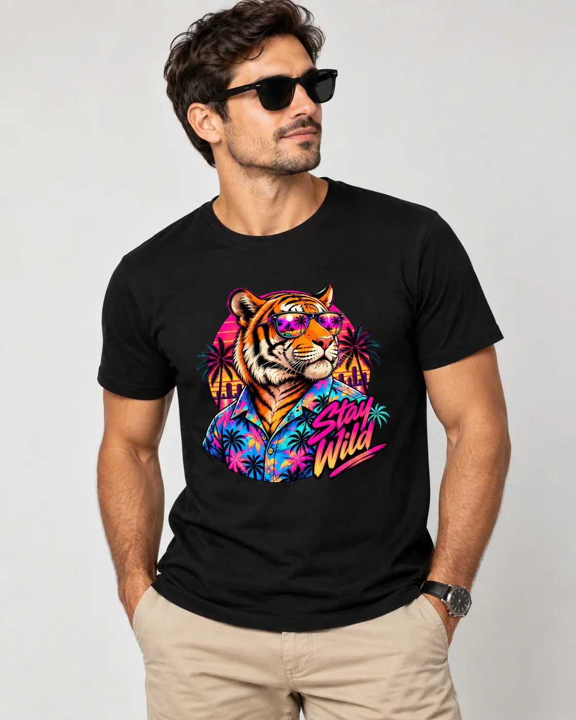
The Stay Wild Tiger tee is one of those tri-blends. Its neon tiger in a Hawaiian shirt holds its colour well on darker shades, and you avoid the sheer issue altogether.
Colours that hide wear (and ones that show it)
If the shirt is going to the court, the garden or a toddler's birthday party, choose for durability.
Best at hiding wear: charcoal, heather grey, navy, olive, dark heathers. They hide sweat marks, small stains and the gentle fade that comes with washing.
Worst at hiding wear: white shows stains, light grey shows sweat, and true black shows lint and fades to charcoal over time. Pale pastels show everything.
Washing matters as much as colour. Cold water, inside out and a low dryer setting keep any colour bright for longer. Our how to wash graphic tees guide has the full routine.
How to choose a t-shirt color as a gift
Gifts are where colour choice gets risky. You don't know their wardrobe as well as they do. 4 ways to play it safe:
- Check what they already wear. Most people have 2 or 3 colours they reach for. Match one.
- Default to black, navy or heather grey. They suit almost everyone and go with everything.
- Let the print decide. If the artwork is colourful, a neutral shirt lets it be the star.
- Avoid colours they'd need to style around. Bright yellow and lime are bold choices for yourself, gambles for someone else.

The Wicked Good Pickleball witch tee comes in well over 100 colour options, which is a lot to choose from. For a gift, the white shown above keeps its pinks and oranges bright, and a dark navy is the other safe bet.
Printing to order helps here. Every shirt in the shop is made after you pick the colour and size, so you're never stuck with whatever's left in stock. For gift-specific help, see our Christmas t-shirt gift ideas and t-shirt size guide.
FAQ
What t-shirt color looks good on everyone?
Navy, black and heather grey flatter almost every skin tone. Navy is often the safest because it's softer than black and doesn't fade as visibly.
Should a graphic tee be light or dark?
It depends on the artwork. Bright or pale art needs a dark shirt, dark line art needs a light shirt, and multi-colour designs usually look best on white, black or navy.
Is heather or solid better for a graphic tee?
Solid shows fine detail and bright colours best. Heather gives a softer vintage look and hides wear, so it suits bold, simple designs.
Why can I see through my white t-shirt?
Lightweight fabrics, especially tri-blends, are semi-sheer in light colours. Pick a mid or dark tone, or plan to wear a layer underneath.
What colour t-shirt should I buy as a gift?
Match a colour they already wear, or pick black, navy or heather grey. If the design is colourful, a neutral shirt is the safest choice.